How German Expressionist Printmakers Looked to the Past for Inspiration
March 21, 2023
Crocker curator William Breazeale, PhD, shares one of the works on view "A Graphic Art: German Expressionist Prints from the McNay Art Museum and the Bronston Collection" and sheds light on its connections to the rich history of printmaking in Europe.
German Expressionism prints, like those on view in A Graphic Art: German Expressionist Prints from the McNay Art Museum and the Bronston Collection, are gritty and evocative, the figural distortions and jarring colors helping to capture feelings and thoughts in visual form. The horrors of the first World War and the chaos in its wake propelled a new examination of culture and art in Germany, and although this was a time of political and social upheaval, it was also a time of innovation. As art movements like German Expressionism evolved, artists like Ernst Ludwig Kirchner, Max Beckmann, and Erich Heckel looked to the past as well as the present to inform their aesthetics.
Crocker curator William Breazeale, PhD, shares a closer look at one of the works on view in the exhibition and sheds some light on its connections to the rich history of printmaking in Europe.
Printmakers know their print history—the German Expressionists looked to the past for media that would express their ideas, especially woodcut and soft-ground etching. Though the British and French had begun a woodcut revival in the late 19th century, the Expressionists looked beyond them to German 14th- and 15th-century religious woodcuts that served as devotional images of saints, prophets, or the Madonna and Child, often roughly hewn and rather crudely printed. They were the earliest woodcuts in Europe, and the start of a thriving printmaking culture in German-speaking lands.
Taking their roughness and crude printing as inspiration, Expressionist artists created a modern, forceful visual language. Likewise, soft-ground etching, popular in 18th-century France as a way to reproduce drawings in black or red chalk, allowed them to explore textures and effects that etching alone could not provide.
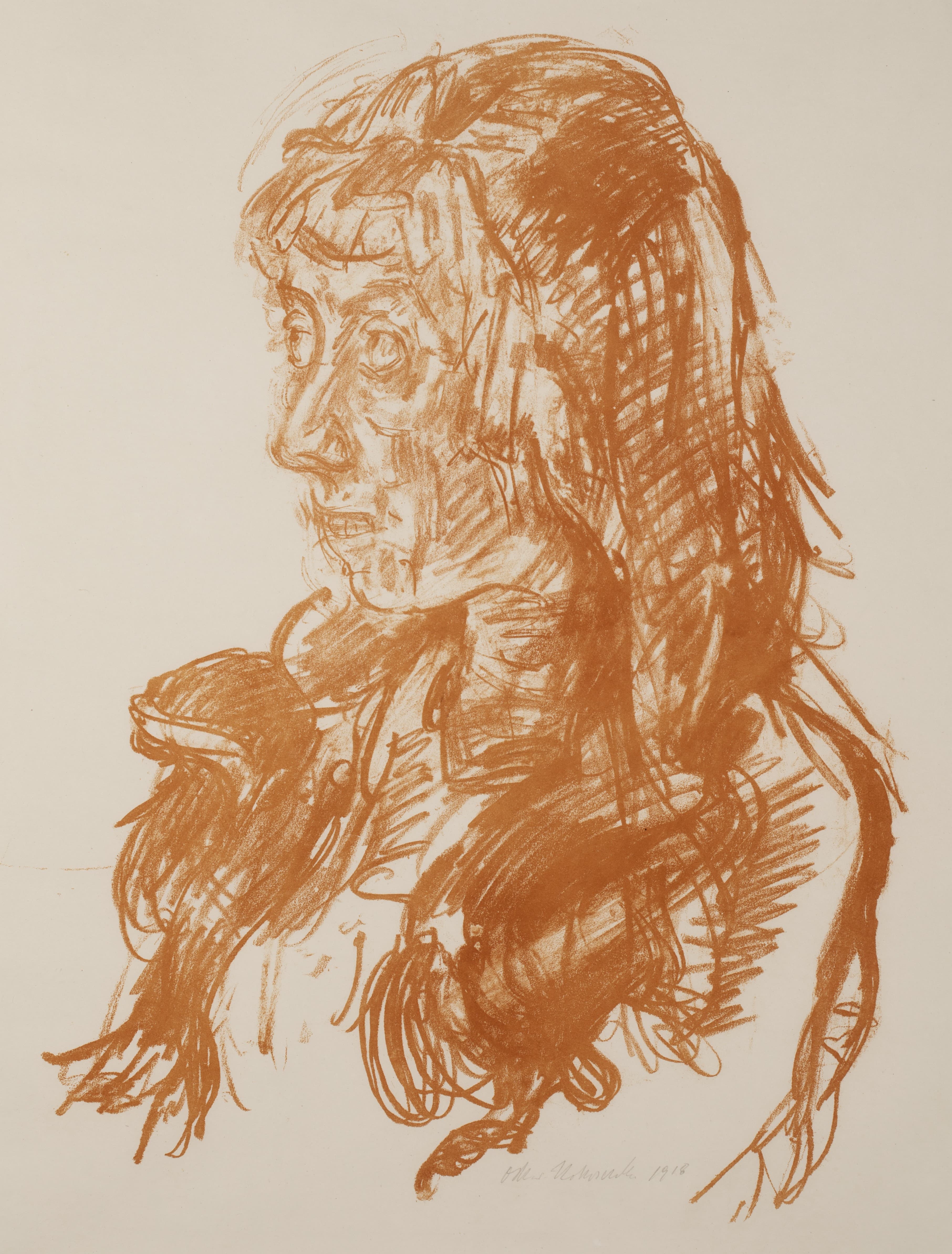
The creator of the lithograph Corona I, Oskar Kokoschka, was not only a professor of art himself, but had friends who were art dealers, art patrons, and art historians. Like his fellow Expressionists who revived print media, he may well have been influenced by print history in the striking use of a deep reddish-orange for this impression of Corona I, one of a few in a primarily black-and-white edition.
Precedents for this color choice have deep roots: even in the early 16th century, contemporaries of Albrecht Dürer such as Ludwig Krug sometimes printed their engravings in orange. Though one can speculate about motives—visual variety, or perhaps imitating the effect of reddish-orange grounds used by draftsmen at the time—the reasoning behind this choice is lost to time. In the 18th and early 19th centuries, when red chalk drawings were being reproduced in prints, ink sometimes imitated the orange cast of certain chalks in the originals.
But it seems that the color was used for effect by other artists, nearer to Kokoschka’s time, who may have been known to him as well. William Blake sometimes used orange ink as a base for multi-colored prints, and some impressions, many posthumous, are in orange ink alone. However, Symbolist artists such as Max Klinger and Jan Toorop used the color in more inventive ways—Klinger’s Abandoned from his series A Life even uses it for the sea and sky! In that print, the brooding, fiery tone heightens the emotional effect, and perhaps Kokoschka intends to do the same.
Whether or not that is the case, and whichever of these precedents he may have kept in mind when making his choice, the use of the orange ink creates a livelier, warmer image than the impressions in black, its hue closer to the tones of skin and hair. It is an effect best appreciated in person.
A Graphic Art is on view at the Crocker now through May 7, 2023.